
A language model can analyse a year of training. All it needs is 120 calls, and at the end there is still no chart you can open again next week.
The first three parts were about what the model needs in the conversation: the approach, the data and the knowledge. This part is about what I deliberately took out of the conversation.
Anyone who trains wants to see regularly how the last few months went. How much per sport? Was volume within the phase's corridor? How much of the plan got done, where was the time spent across the zones? These questions have fixed answers that follow from the data. You don't need a language model for them.
The attempt in the chat
On 14 October I tried it anyway. Claude was to build an analysis as an artifact from the data in my account, around 200 sessions from one year: weekly volume, zones, load, plan versus actual. Through the MCP tools, with no outside help.
The result looked good and showed two things. The first was unexpectedly useful: adding everything up exposed three bugs in the server. Older duplicate versions of a session had not been merged retroactively, time in zones was counted by percentage of maximum heart rate instead of by the user's own zones, and a planned session of type "other" occupied every sport on that day. My tests hadn't found any of the three. If you add up a year of data in one go, you hit the edges.
The second was the effort. For the zones over six months the artifact needed around 120 calls to activity-detail, one per session. That takes time, it costs context, and next time everything starts from scratch. An analysis you look at every week doesn't belong in a conversation that recalculates it every time.
One endpoint, everything calculated
So the web version calculates on the server, in a single call:
GET /api/analytics?weeks=52
The response contains everything the page needs, split into sections: calendar weeks per sport with duration, distance, load and zones, the phases with their targets in the version that applied in each week, months, totals, daily load with CTL, ATL, TSB and ACWR, trends per session, vitals as weekly averages and the races from the goals. The same sessions are counted as for load in the chat, meaning only the leading version of a session delivered several times. That way the numbers on the web and in the conversation match.
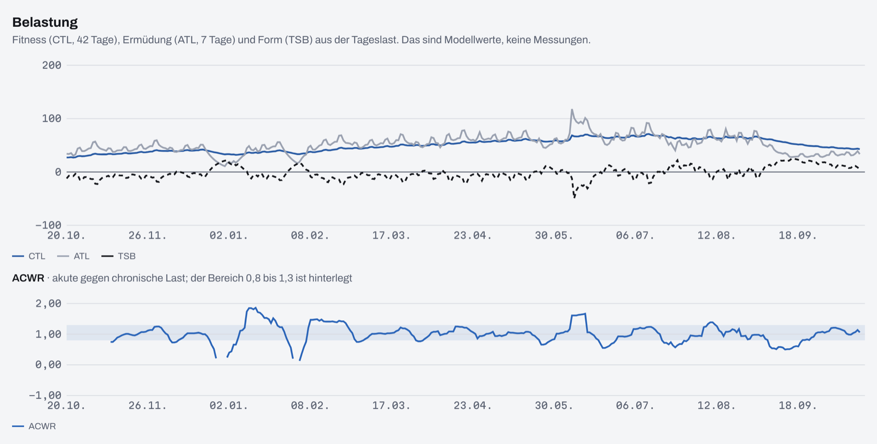
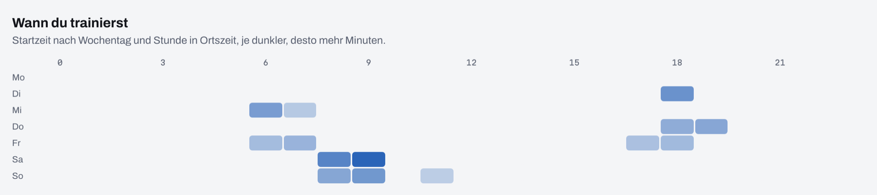
The page itself has five tabs: overview, plan, load, intensity and personal bests, plus a period of 12, 26 or 52 weeks and a filter by sport. Among other things it shows weekly volume as stacked bars with the phases as bands behind them and races as markers, the phase corridors, plan versus actual, the load curves, zones per week and month, and a heatmap of when training happens: weekday against start hour.
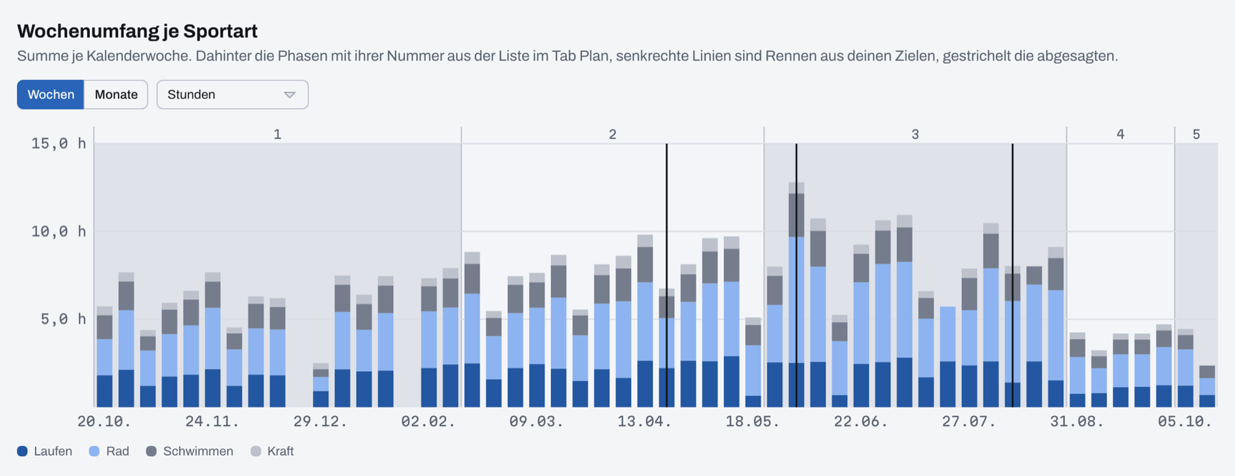
The charts are custom SVG components in Nuxt, without a charting library. That was more work than a ready-made package. In return they look like the rest of the site, and I can decide at every point what appears on mouse hover.
Show, don't judge
The most important decision for this page is a single sentence in the concept:
The charts show, they don't judge. The language model writes any assessment in the coach note.
The analysis says that running volume was above the phase corridor in three out of four weeks. It doesn't say whether that is bad. Maybe there was a holiday, maybe it was intended, maybe a race is coming up. The model knows that because it knows the conversation, and so that is where the assessment belongs.
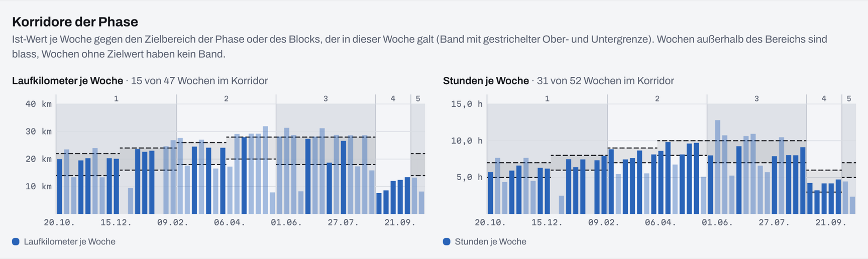
The explanations on the charts stick to facts. They give the change against the four weeks before, whether a value is within the target range, or what a TSB value means on that day. Whatever doesn't exist in the data is left out instead of showing up as zero.
The same applies the other way round. The planning page on the web shows the week, the season and the structure of each session. You can't change anything there. Planning and replanning happen in the conversation, and the page shows what came out of it. Two places where you can edit the same plan drift apart sooner or later.
The two meet in one place: the individual session. The detail view shows heart rate and pace over time, elevation profile, zones and laps, and below that two notes. The user writes one, the model writes the other through the coach-note tool. If you ask in the chat how a run went, you will find the answer on the session afterwards too.
Personal bests, and why swimming is missing
The fifth tab shows personal bests: for running from 400 metres to 50 kilometres, for cycling the best power from five seconds to 60 minutes, each for the last 42 days, the season and all data. On top of that there is a pace curve with critical speed.
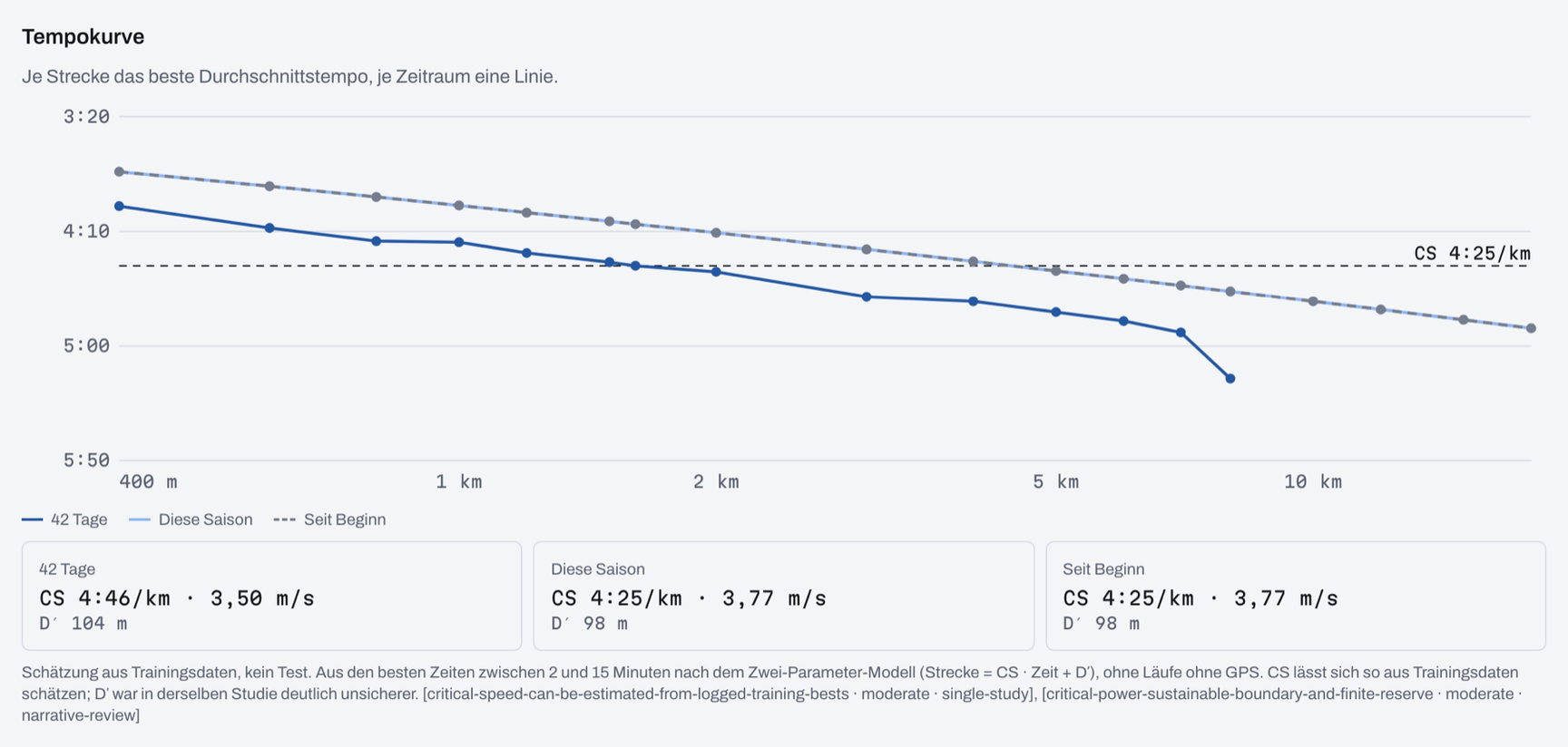
Swimming is missing on purpose. For continuous front crawl the watches usually count lengths correctly. With a stroke change in the middle of a length, all tested models were off in one study. Best times from such recordings wouldn't be reliable, and a wrong best time is worse than none. The reasoning is a card in the compendium, with evidence strength "weak" and the note that it is a single study.
Conclusion
Everything that needs judgement stays in the conversation: planning, replanning, putting things in context, asking back. What has fixed answers and gets looked at again every week is on the web. Both sides calculate with the same numbers, and as long as neither takes over the other's job, they fit together well.
That wraps up the series for now: from the chat as an interface through the data and the training knowledge to the analytics next to it. Next up is the session's route as a map. The concept is written, but it isn't built yet.
Call to Action
Until the end of October training mcp runs as a beta with a small group of users, the public launch is in early November. Analytics and the detail view are part of the Plus tier. Everything else is at https://training-mcp.app.
If you have read the series and something is missing or unclear, let me know.